CP Feed Embed Options

You can learn more about content promoter (CP) and how to set it up here

Content managers can add a news feed or other content to other web pages on their website.  They can choose among the following layout options that make the most sense for their purpose:  stacked, 1-column, 2-column, 3-column, headline, magazine and card style columns.  Each option pulls the number of articles/content pages you choose, from either the most recently published articles available from your selected news sources inside USU Omni CMS websites (based on date) or by priority if you are using the basic content promoter feature.

Component
You can add this content using a component. Learn about components
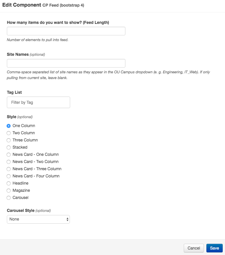
CP feed component set-up screen

Feed Length

Feed length (feed-length=”1”) refers to the number of articles you want to pull into your CP feed.  In the code example you are only pulling one article. You will want to consider the style you are choosing when selecting the number of articles to pull.  For a two- or three-column style you may want to choose two or three articles, respectively, to get the look you want.

Tag List

Tag List refers to the tags you want to pull.  News is a good default because it’s the default for all news articles, but you can add more tags by separating them with a comma and a space (i.e. News, Science).  The articles that get pulled must match all listed tags.

Sitenames

Sitenames refers to names of the websites in Omni CMS that you want to include in this article pull, they must appear exactly as they do in the dropdown menu.  If you only want to pull articles from your own website, you can leave this blank.

Style

Style refers to the type of layout you want for your CP feed.  Your choices are: stacked, oneColumn, twoColumn, threeColumn, headline, magazine and card columns. Each option spans the width of the column in which you place the code asset.

  • Stacked: includes the image to the left, title, publish date and description to the right (unless on a mobile screen, then it stacks the content on top of each other (image, title, publish date, description)
  • oneColumn:  includes the image, title, publish date and description
  • twoColumn:  includes the image, title, publish date and description; it is best to select only two articles for this option, more than that may not look the way you want on your page.
  • threeColumn:  includes the image, title, publish date and description; it is best to select only three articles for this option, more than that may not look the way you want on your page.
  • headline:  includes the article title
  • magazine:  includes the article image, title and publish date; image quality matters, and could become an issue if used full width without selecting an image specifically for that option
  • Card columns: same as the above column options just style differently.

You can use more than one of these components on a page.


Stacked

The stacked layout option will span the width of the column in which you place the component and includes the image side-by-side with the title, publish date and description. On mobile, it will stack responsively with the image above the title, publish date and description.

One Column

The 1-column layout option will span the width of the column in which you place the component and includes the image, title, publish date and description.

Two Column

The 2-column layout option will span the width of the column in which you place the component, splitting the content into two columns (one for each article) and includes the image, title, publish date and description. NOTE: It is best to select only two articles for this option, more than that may not look the way you want on your page.

Three Column

The 3-column layout option will span the width of the column in which you place the component, splitting the content into three columns (one for each article), and includes the image, title, publish date and description. NOTE: It is best to select only three articles for this option, more than that may not look the way you want on your page.

Magazine

The magazine layout option will span the width of the column in which you place the component, and includes the article image, title and publish date.  Note that image quality matters, and could become an issue if used full width without selecting an image specifically for that option.

One Column Card

The 1-column card layout option will span the width of the column in which you place the component and includes the image, title, publish date and description.

Two Column Card

The 2-column card layout option will span the width of the column in which you place the component and includes the image, title, publish date and description.

Three Column Card

The 2-column card layout option will span the width of the column in which you place the component and includes the image, title, publish date and description.

Four Column Card

The 4-column card layout option will span the width of the column in which you place the component and includes the image, title, publish date and description.