Website Review
A website audit is the process of evaluating and verifying the relevance, accuracy, performance, and long-term stability of content elements and information assets on the website. In other words, this review is to ensure that your content is up-to-date, relevant to your audience, and accessible to all web users.
Overview:
- Why: To maintain an up-to-date, accurate, and quality web presence
- What: Check every web page and file for accuracy and quality
- Who: Every Site Owner, Site Manager, and Content Contributor play an important part in this audit process
- When: Annually (minimum), or as often as needed
- How: Refer to these Website Audit pointers, and use the Audit Checklist to resolve common problems
Other Benefits:
- Ownership and responsibility of content is renewed
- Reduced bulk and weight of website
- Correct projects that have “gone astray”
- Take advantage of latest technology updates and enhancements
Every page can be tested for accessibility issues with a web accessibility evaluation tool, such as https://wave.webaim.org/ (this can be added to your browser as a single-click plugin if you don’t want to copy/paste the URL for each page). Why does it matter if your website is accessible? To make sure your site is updated regularly, and follows accessibility regulations, please complete the following checklist every 12 months, minimum. If you’re satisfied with the state of each item, check the box on the audit checklist.
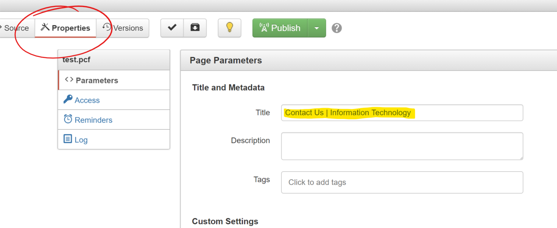
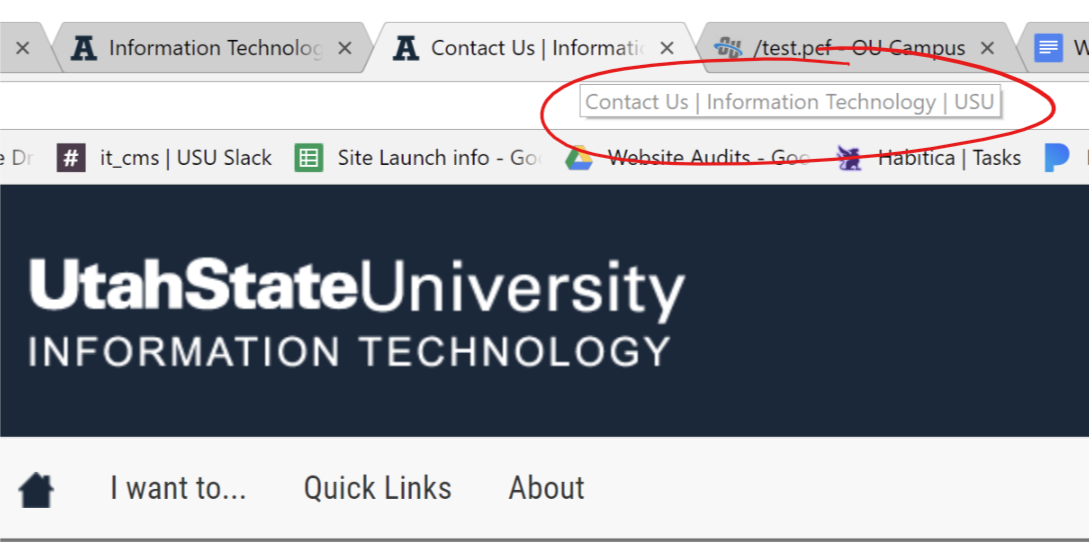
Page Titles
All page titles should follow this structure: "Page Title | Site Name | USU"
- " | USU" is appended to the end of every page title automatically, so don't manually type it out, just the page title and site name
- Check every page and update regularly!
- Attractive sites are perceived as easier to use, whether they actually are or not.
- Remove old content - (Does this landing page for an event from 2014 need to stay around, or can it be deleted?). Don't be afraid to delete unnecessary content! The web is dynamic and content is always changing. Consider saving old pages as PDFs in a Box folder or other archive space.
- Consolidate - (Could these three pages with one paragraph each be combined into one page?)
- Publish pages at least once every year, even if it’s just to confirm the page is still relevant and in use. Pages not getting published at least once every 12 months may be flagged and possibly deleted. (Note: It is possible to publish the entire site at once, but it’s strongly recommended that each page receives a review, to make this step worthwhile.)
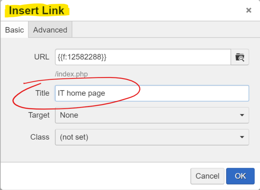
Avoid using entire URLs as a link, unless it's a branded URL (i.e. MyID.usu.edu). Instead, type out a meaningful direction and link the text with the appropriate URL. For instance, One-Column Page Layout makes more sense than https://it.usu.edu/web/page-layouts/onecolumn-standard, even though they're the same link.
Note: It isn’t necessary to show the full URL on a page, instead of regular text. If someone wants to copy a link, they can right-click on the link and copy the URL.
Don't use text such as "click here" or "read more" for links. Not only are they an accessibility problem, but they give no direction to someone using a screen reader. Many people who use screen readers scan page content by keywords and links, as do most users without disabilities. If the screen reader reads only the links on a page with "click here" link text instead of keywords and titles, the user gathers no information or direction from those links. The website owner is essentially forcing those with visual disabilities to read the entire page word-for-word to gain context from the material.
i.e. non-descriptive link vs an informative link:
Non-descriptive link, doesn't indicate a destination:
Utah Press Association's annual newspaper contest.
More...
Informative link, indicates a destination to screen readers:
Check out all your tutoring options to stay ahead this semester.
Avoid linking entire sentences, rather than keywords or phrases. This may require rewriting a paragraph or two, but short, concise links hold more emphasis than entire linked sentences and will draw more attention. Link text should be brief, succinct, with clear actions or directions. (Refer to any Wikipedia article for a great example!)
Links, continued:
- Internal links (links to other pages within your website) should open in the same tab - don't open a new tab for every link
- External links (links to other websites), and files (on OR off your site), should open in new tab - users will be directed away from your site
- Rule of thumb: if you can’t see your site’s navigation anymore, it should open in a new tab
- Should visually appear as a link, underlined and/or blue, or as a button
- If a header is a link, it doesn’t have a color or underline, so it’s not an obvious link to your users. Consider using a different way to emphasize your text, besides header text, so your hyperlinks will show up properly
- If an image is also a link, the link title should indicate the link destination, while the image description text should describe the image.
- If the image is a picture OF text, it should be styled text instead of an image. Buttons are supposed to be styled in code, not linked pictures.

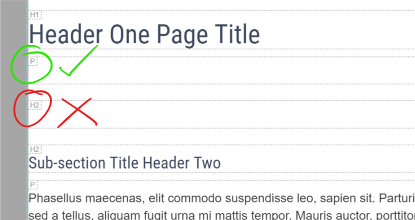
- Headers are for STRUCTURE, not necessarily design. Properly-nested headers should look nice, but they are primarily for content structure and hierarchy.
- Only one H1 per page - the page title.
- If a page contains an H3, it should first have an H2 - properly nest.
- This affects Search Engine Optimization (SEO) and accessibility!
- Shouldn’t be links!
- Headers aren’t designed to look like hyperlinks, so the links aren’t as obvious on your page if they’re in header text. Consider a style change for any linked headers.
- “Empty header” accessibility issues
- Edit content with Show Blocks tool turned on. Are you using
containers for white space between content, or
containers? containers must have content or they are considered “empty headers,” a common accessibility issue. or “paragraph” containers are more appropriate for adding aesthetic white space to your page.
i.e.
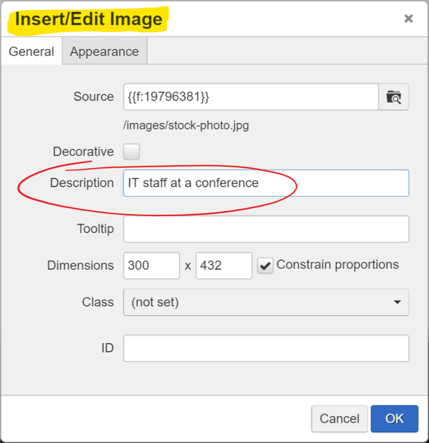
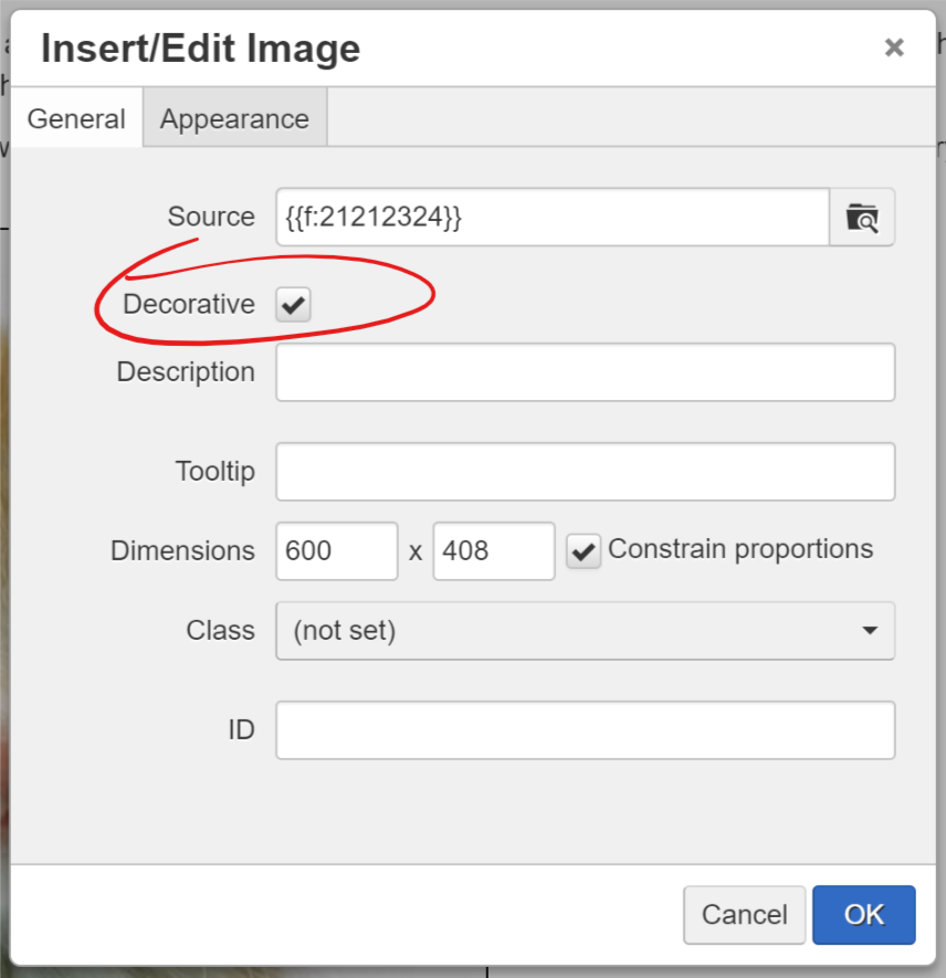
- Alt text/descriptions - images that add context to the user’s experience on your website should have meaningful descriptions. If the image is purely for decorative purposes, it can be simply marked as “decorative” in edit mode
- Fuzzy images should be replaced with better copies or different images
- If you need better images, but you don't have any for your department, you can use images from Thinkstock Photos. Just send the image ID number to itweb@usu.edu and the IT Web team can download it for you.
- If an image takes a long time to load on a page, it might be too big! Try resizing the image and uploading a smaller version so it loads faster. (Note: This requires using a smaller, different version of the image, not just resizing it in the Insert/Edit Image pop-up. Changing the dimensions in this pop-up will alter the visible size, but not the actual size of the image. If you need help cropping images within OU Campus, or on your desktop, reach out to itweb@usu.edu.)