Components
Components are a form-based type of reusable content that simplify entering information into complex design elements. When a component is placed on a page, it acts as a form for you to enter information into. Then that information is placed in the source code of the component and added to the page.
Once created, a component is launched, making it available for use on pages. Components are like assets in that changing the original item affects the pages it is placed on, but also like snippets in that they allow for on-page editing.

Insert Onto Pages
Components can be inserted onto pages or other files with editable regions. To add a component to a page
- In an open editable region, click "Insert Component" in the toolbar.
- Choose the component you want, and click Insert.
- Fill out the component fields. Anything not marked optional is required, and must be filled out for the component to be placed on the page.
- Click Save. The component is entered into the page with your answers.
- Continue editing the page, or save and publish for your changes to appear on the live site.
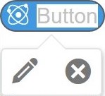
Edit/Delete A Component
- In an open editable region, locate the blue pill button with the name of the component that you would like to edit.

- Click on a component to either edit the component answers (pencil icon) or delete it from the page ("x" icon).
Things to Know
- The same component can be added to a page multiple times, with unique form content for each instance.
- If you revert a page with a component added to it, the content entered into the component is reverted as well.
- If you use the Source Code Tab inside of the editor, everything inside of the '~' symbols is part of the component. Editing or deleting any part of this code can disable or break your component.